
When we decided to develop a simple metric reporting tool, one of the questions we were asked by one of our friends was: “Isn’t BI tooling a solved problem? I mean, why bother?”
We probably should have asked ourselves that question prior to starting development, but it forced us to examine the reasons why we felt there was still work to do in a space that is already so saturated with solutions.
The solution we came up with came from our time at Flexport, where we were part of a team implementing company-wide weekly business reviews.
The first iterations of these business reviews used dashboards with lots of charts and graphs, hosted in one of the major BI Tooling suites, and running meetings using these dashboards was awful. People wanted to jump around from metric to metric, view to view, and managing that process was a practical nightmare.
Our weekly business review product eventually became a series of clearly defined metrics listed out in a tabular format in google sheets, categorized by type, and exported as a static PDF. Why PDF, because a report should be immutable, atomic, and persistent for historical record.
After using some of the most cutting-edge visualization and data discovery tools we had at our disposal, the solution that actually worked to help executives grok what was happening with their business was a static report, of only tables and line charts.
When we reflected on this, the answer to the question: “Why bother?” was this: Because BI tooling today is designed to do everything except make insights easier to get to.
 90s kids will remember the epic gem of a movie that is “Spy Kids”. In it, the kids’ uncle Machete (played by the inimitable Danny Trejo) gives them watches filled with gadgets that do everything except tell you what time it is. BI tooling is like that.
Danny Trejo cameos aside, over time BI tools have become more and more bloated with additional features–for example: enabling additional data exploration, sharing, encouraging users to build suites of complex reports hosted entirely within a single BI ecosystem. The modern BI tool today is basically a casino designed to keep you spending as much time working and exploring data in the tool and as little time moving data out of the tool as possible.
The problem is, the incentives driving these enhancements aren’t focused on the goal. Which is to give stakeholders access to the information they need to make accurate business decisions.
The reasons WBRs are easier with spreadsheets is because spreadsheet data exploration and presentation options are limited to the exact same structure–you don’t have to switch windows or tabs to view data vs. edit it, and you can organize the data in a simple and legible manner for everyone.
That’s why we are developing Rapid Reports–to provide a simple and extensible alternative to BI tooling.
What are the benefits of simplifying BI tooling?
- Increases speed to insight by keeping information structured, and making presentation and comprehension straightforward.
- Elevates the role of data analyst to one focused on modeling and managing metrics and metric layers, rather than building dashboards and reports
- Empowers the end user with easy access to the key metrics they want to track at the click of a button.
- Encourages end users to dive directly into the database, or work with an analyst for deeper insights.
What are the characteristics of simple BI tooling?
- Integrative - Data can be exported and reused or re-visualized easily.
- Rote - Process for loading data, exporting data, and even reading and interpreting data is repetitive. It doesn’t matter if it’s boring, attention should be paid to the story the data tells.
- Automated - Key workflows should be hidden from end users.
- Collaborative - Outputs should be shareable and easy to understand.
We’ve designed Rapid Reports to maximize the benefits listed above by focusing on the key characteristics listed a bit less above.
What exactly is rapid reports?
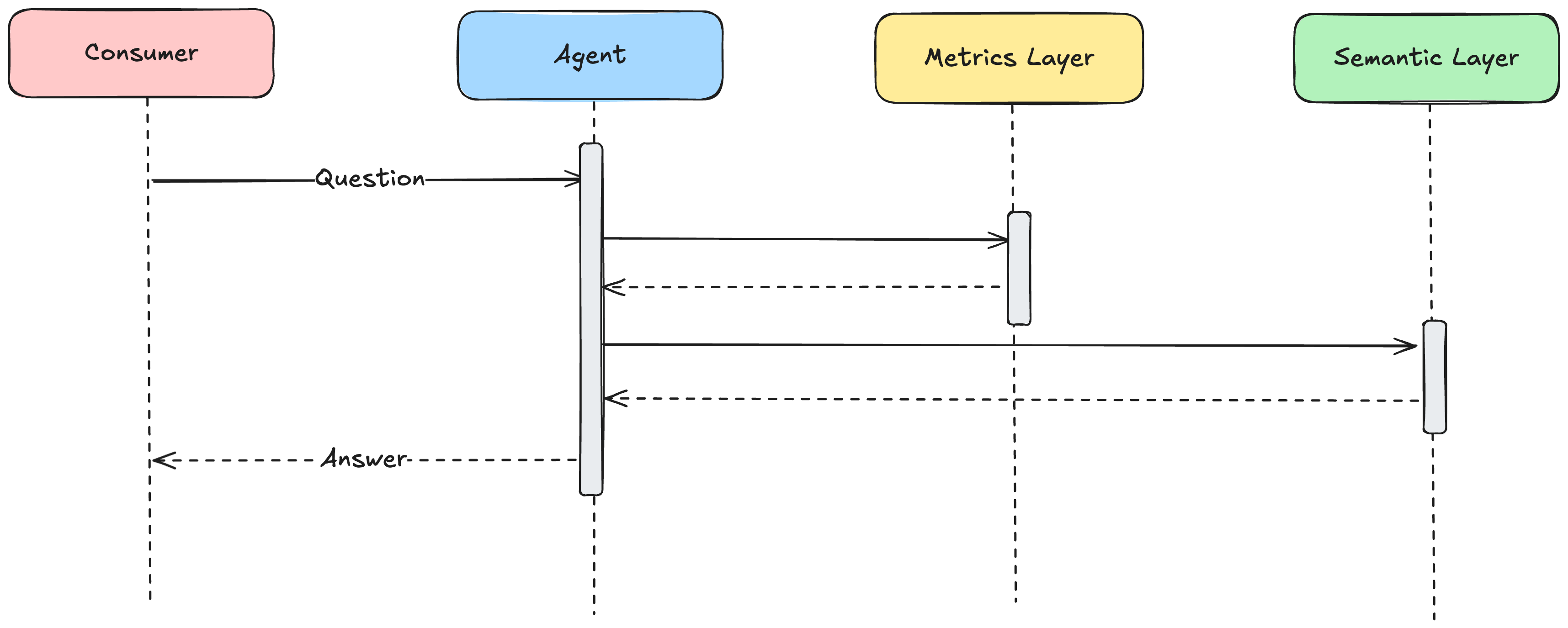
Rapid reports is a simple and elegant library we have created to generate static reports by connecting to a standard metric layer. If you use dbt metrics you’re already 99% of the way there. Simply create a config file that specifies what metrics you want to report on, and at what cadence/format and you’ll have a report at the press of a button. The idea is to provide immediate reporting for key metrics directly from your existing database and accelerate your speed to insights without expecting your executives to know sql. Focus on actions, not on reports. And because simple and beautiful things should be free, it will be open source on our github.
We’ll be sharing the code and an explainer soon, but for now, enjoy this example static report we generated about the 2016 NBA Postseason (my personal favorite).