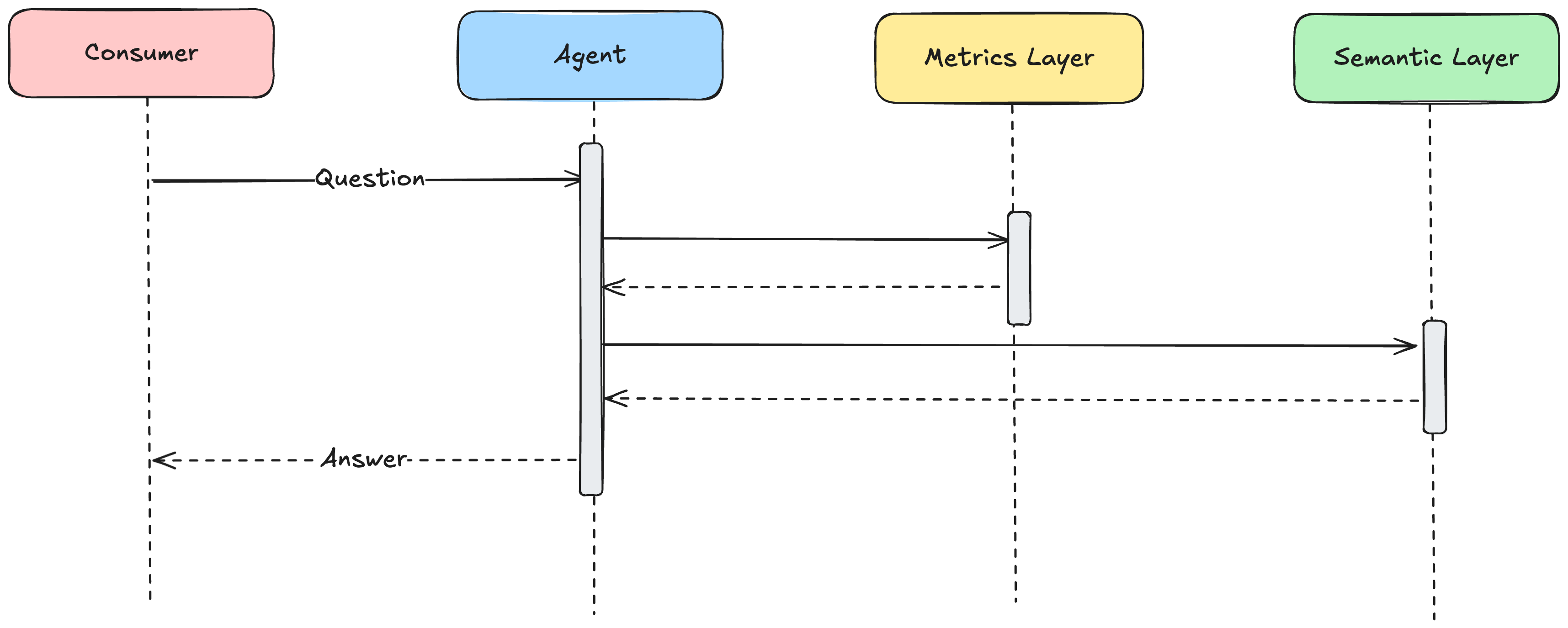

Selection of data visualization software(s) is a problem that any data driven organization will inevitably encounter. I’ve written previously on the inevitability of Excel in finance driven orgs, and offered contributions towards the simplification of standardized reporting with an open sourced project, Rapid Reports, to quickly and easily generate standardized reports atop metrics layers.
In this post, I want to condense the opinions of Snowpack into a broader treatise on what we’ve learned from the number of BI tools we’ve used. This will by no means be an exhaustive list, and the specific needs and requirements of each business will certainly drive the ultimate decision making process, but we want to offer a high-level breakdown on the tools we’ve encountered to provide some advice in the decision making process.
In creating a matrix generalization of BI tools, people often default to feature limited to feature rich as an axis. While I think this can be helpful to visualize, I find that the “features” themselves are not the nuance here, but the target of the features. I think a more viable spectrum would be “SMB target to Enterprise Targeted”. The SMB targeted are often going to be more feature limited, however the features that separate the Enterprise targeted tools are often features that are less required by SMB targeted companies such as high customization in data security and access, integration with SSO services, and ability to provide 3rd Party reporting services.
The second axis of the matrix delineates BI software on the intended technical prowess of the end user. This is a necessary tradeoff with the required support of the service. A service that has a low bar for technical prowess (think Looker or Tableau) for the end user, will typically require analytics staff to curate and prepare the BI tool for consumption, but those dashboards may never require interaction more advanced than refreshing and selecting filters. On the other side of the spectrum are tools that require a higher technical bar, often leverage self-service SQL queries embedded in individual dashboard components like you might see in Metabase require someone with SQL experience and a knowledge of the underlying data to produce or edit each visualization, but can theoretically function without any analytics support.
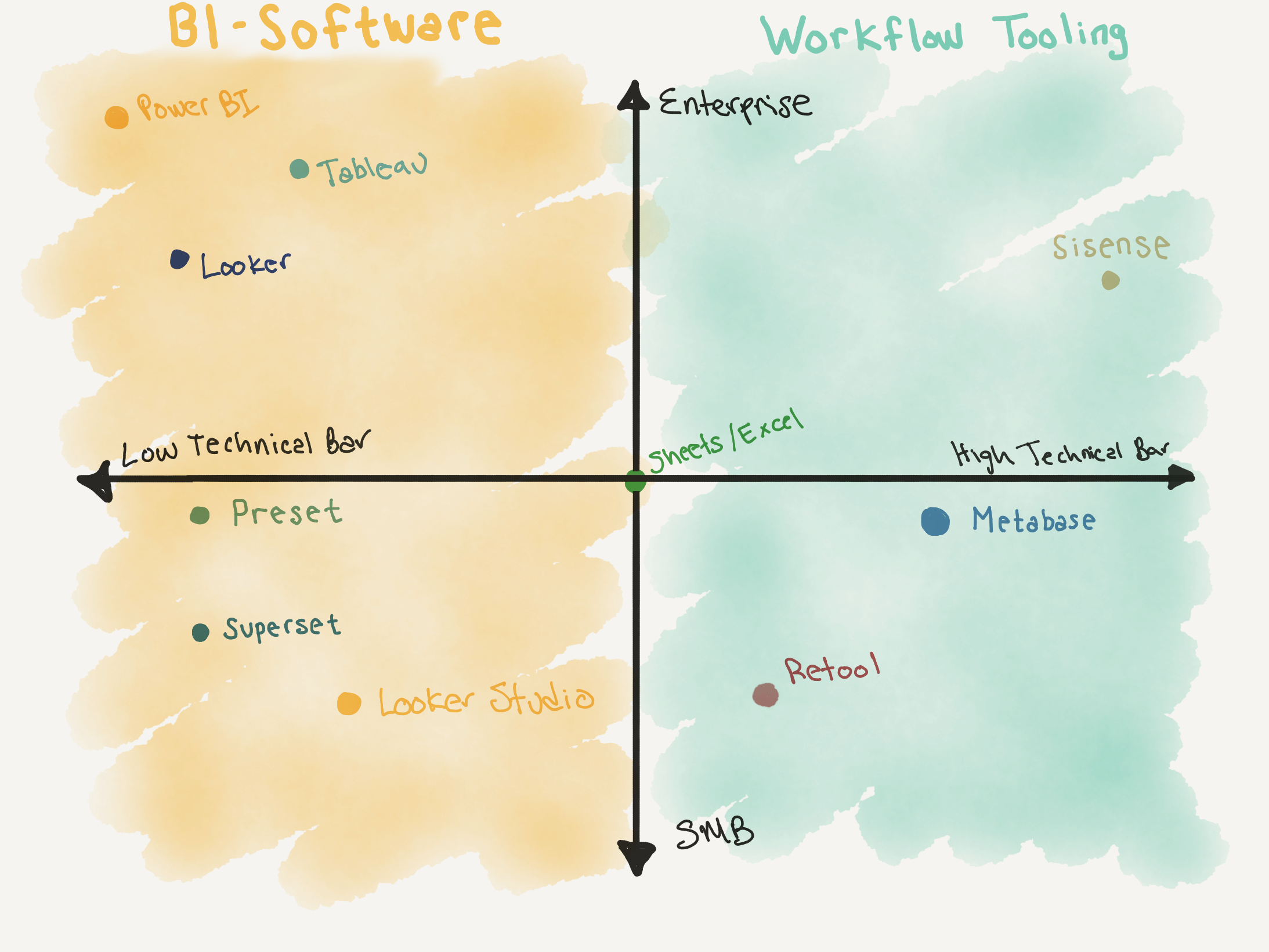
I find this matrix helpful for determining what tools may be useful for your organization, with many organizations opting to provide two separate tools. A high-technical-bar dashboarding tool on the right side of the chart for technical users, and high-iteration type information, like workflow tooling. And, a low-technical bar tool for business users, who need highly curated and accurate data that is ultimately managed by the analytics team. Ultimately part of what we recommend at Snowpack is not making the jump to a highly managed service until you really need to. Operating a BI tool on the left side of the chart without enough analytics support will often create more problems than it solves, a problem that’s only exacerbated by introducing more overhead to setup and manage the tool.
So with that said let’s get down to each of the tools. We’ve provided a quick blurb on what we think the pros and cons and target use case of each tool we’ve worked with is. We may add or amend this as we gain more experience with tools in the industry or the fundamentals of any of the softwares changes.
Looker
The current industry standard. The per-seat price tag is high, and the cost of analytics staff required to make it work smoothly is even higher. We only suggest this for large organizations that need the full breadth of tooling it provides. Endless customization and management of the underlying LookML can lead to both pros for the business user and cons for the analytics staff that has to manage it. If you require granular row and column level permissions, SSO, 3rd party reporting, and a need to enable self-service data exploration across the business then this is for you. Costs can scale out of control here from both the per-seat licensing, and the database query costs that are generated as scheduled queries and background refreshes can scale out of control. Looker is also largely a 1-way door, much of the LookML that is generated will not be portable to other platforms, the product lock-in is strong.
Looker Studio (formerly Data Studio)
Looker studio is aggressively bad, so much so that it feels purposeful. The only saving grace is its relatively simple syncing with BigQuery, but the entire software is seemingly built to upsell you to Looker. Poor visualization options, baffling bugs, generally poor performance and absent customer support mean that you’ll end up with more frustration than the value you get out of this. Stay away unless you have no other option.
Tableau
Tableau is similar to Looker in a lot of ways. We find that the visualization options are unlimited and richer than Looker, but customizability suffers. End users are limited to pretty tight swim lanes that are tightly managed by the underlying analytics architecture. Tableau thrives in organizations with an analytics team to support it, but does not offer the end user options that you may see with Looker.
PowerBI
Are you on the microsoft stack? Well, then you’re stuck with PowerBI. Truthfully of the big 3 (Looker, Tableau, PowerBI) this is the tool our team has the least experience with. From what we've seen, it integrates quite well with organizations that already have a full Microsoft Stack and provides nearly endless options for data visualization.
Sisense (formerly Periscope)
Sisense is like many other customer SQL-> report tools with a few extra tricks up its sleeve. Access to Python and the ability to provide decomposable chunks of code that can be reused across the org make this friendlier to larger orgs than competitors like Metabase. That being said, the technical overhead of generating reports means that self-service tooling for nontechnical users is a nonstarter, and reports must be built custom. Finally, any kind of migrations are going to be a nightmare, if you change a table name, you could find yourself with dozens of failed reports with little to no warning.
Metabase
Metabase is similar to Sisense, and again features in-editor SQL that generates reports. Some components are reusable, but not in the same plug and play manner as Sisense. We find the overhead with using metabase to be lower than that of Sisense, at a tradeoff to features and visualizations. Metabase is a great option for early to mid-stage businesses that need to provide reporting to technical users and have not yet scaled to a full sized analytics org. This has quickly become Snowpack's go-to option as a first suggestion for data visualization at growing organizations.
Google Sheets/Excel
These will never go away, and will remain the “swiss army knife” of analytics. We simply included these to provide context to the location of other tools in our diagram. But, if I had to offer my two cents: I think that the value proposition of Google Sheets has finally surpassed Excel. In a world where communicating information is the goal, Google Sheets thrives where Excel stumbled. Sheets are online and multi user by default, gone is the world of model1_v7_final_final_actually_final.xlsx. The finance bros are going to come after me and mention Microsoft 365, the new online features, and the deeper feature set of Excel. All of that is correct but, I don’t want to pay for another Microsoft service, the online features are not as seamless as Google Sheets, and if you find yourself as deep in the feature set of Excel as people claim they want to be, then you should probably be writing actual software and using a database, not accessing a 40GB excel file on a shared drive. Sheets should be used for sharing relatively simple subsets of information that can be clearly communicated, not generating a complex forecasting model that will break down if a number accidentally gets formatted as a date.
Superset
The open source little brother of Looker. We’ve found Superset to be a perfect fit for self-service analytics and some analytical overhead. The features aren’t so rich as to send your analytics team down an inescapable rabbit hole, but offer enough customization that you can reasonably solve most problems. Self-hosting can be easier than you expect, Snowpack has been able to set up relatively simple instances in an afternoon. Another feature that we like that is consistent across Superset/Looker/Tableau/Preset is that when architected correctly, enforces good data engineering patterns in the underlying datasets, which will reduce lock-in and make upgrading to more enterprise-ready services easier.
Preset
If you want to run superset but don’t want to self-host, welcome to Preset. The pricing is a reasonable $20/mo per head annualized, especially if you compare this with the salary of a Infra/DevOps engineer, you may find this to be a bargain for burgeoning organizations. There are nuances to the tradeoffs you get with Preset vs Superset, obviously Superset has more customization and the guardrails are a bit tighter with Preset, but this comes with a more self-managed system.
Retool
Retool is more valuable for operational workflows than business intelligence, though it can span both. It’s a no-code solution that enables quick apps on top of your database. They’ve expanded to include a lot of other features, but the most successful use case we’ve seen is being able to quickly ship internal tools.
The Rest
There are a number of additional BI tools we've had our eye on that we plan on piloting and providing our thoughts for our clients. These all fall into the category of more niche products for specialized organizations, however we think that some may have some solid merits.